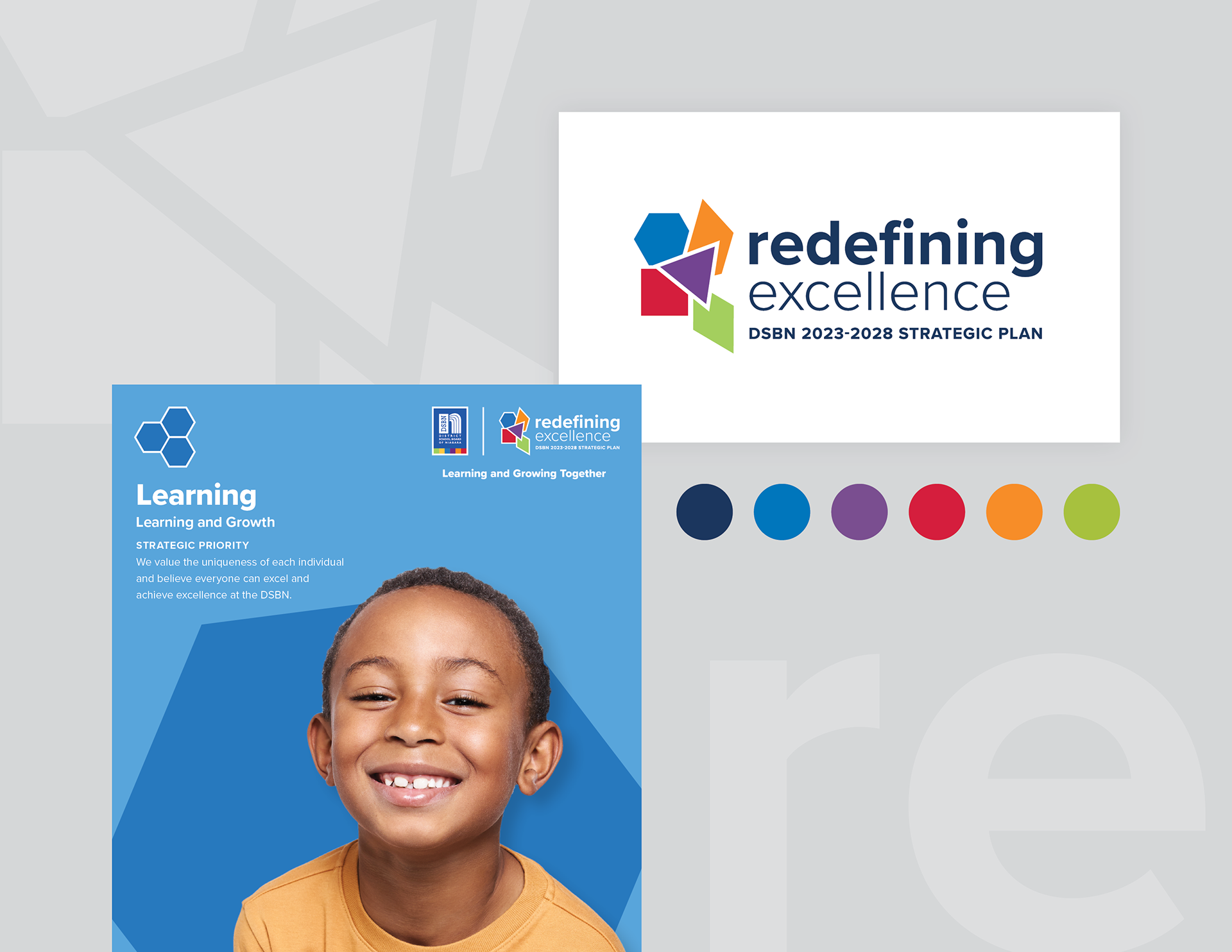
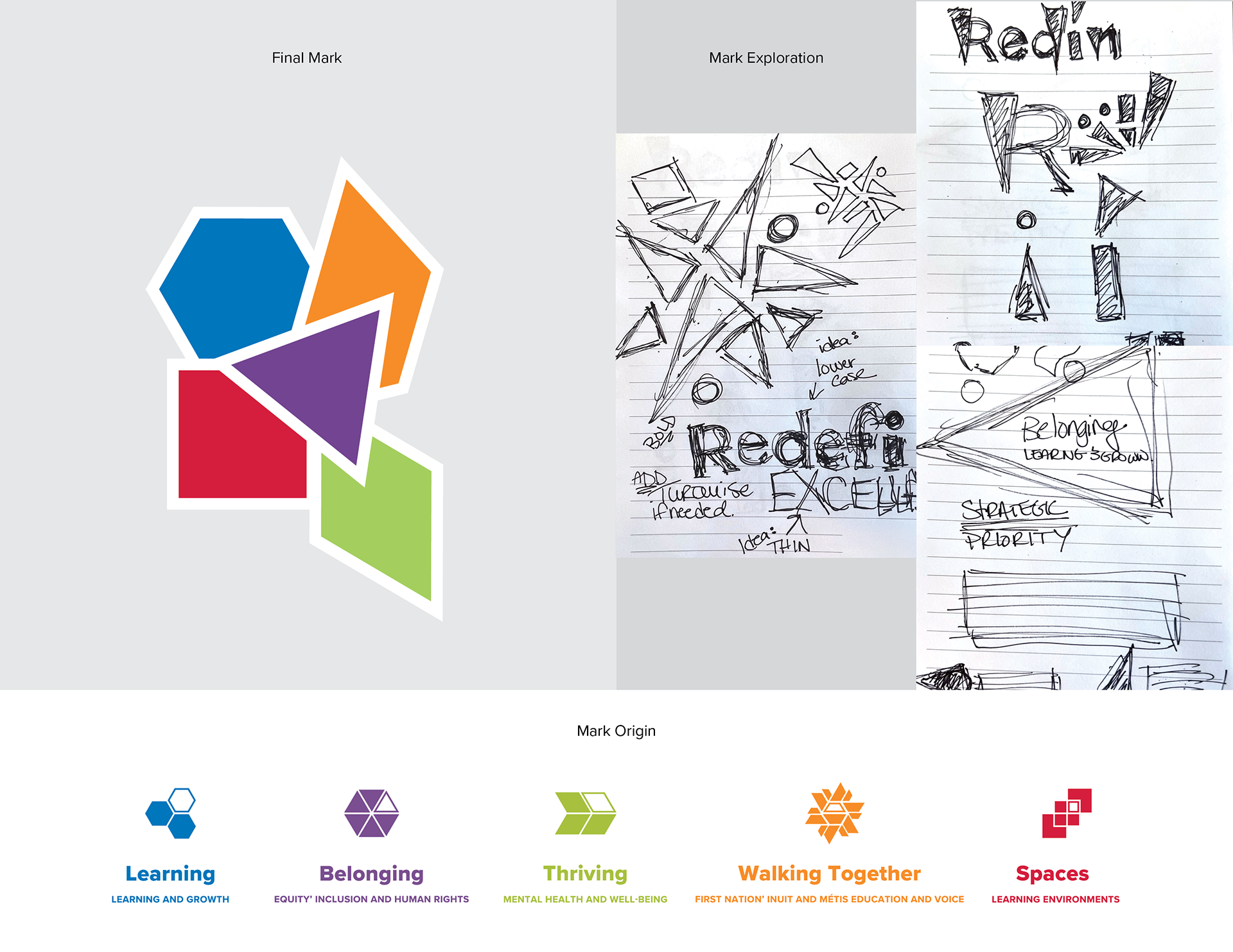
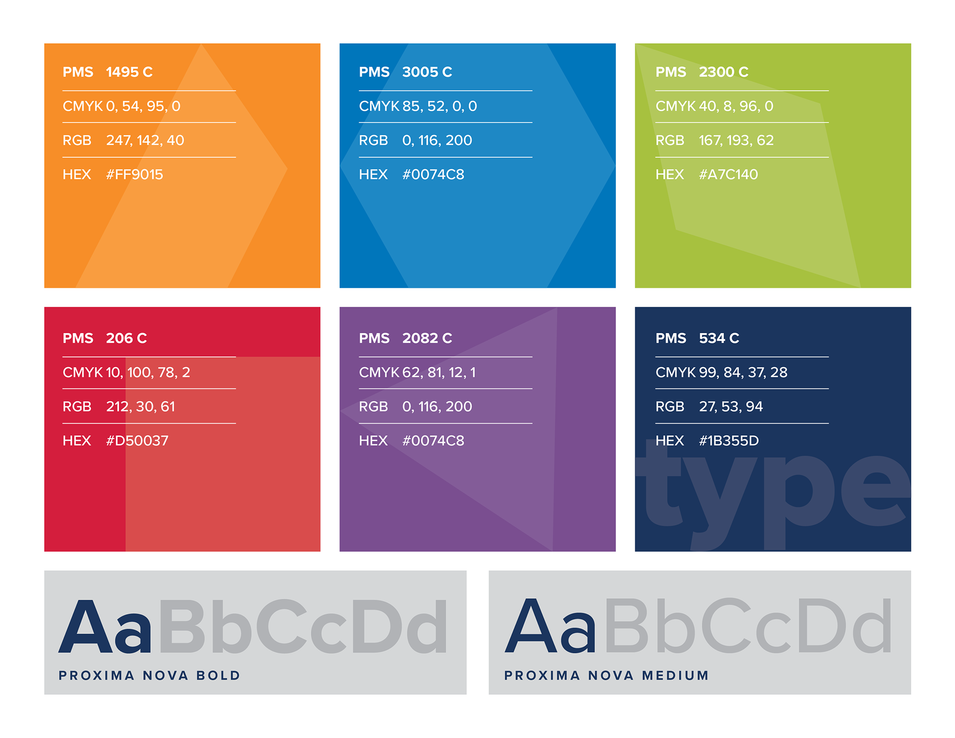
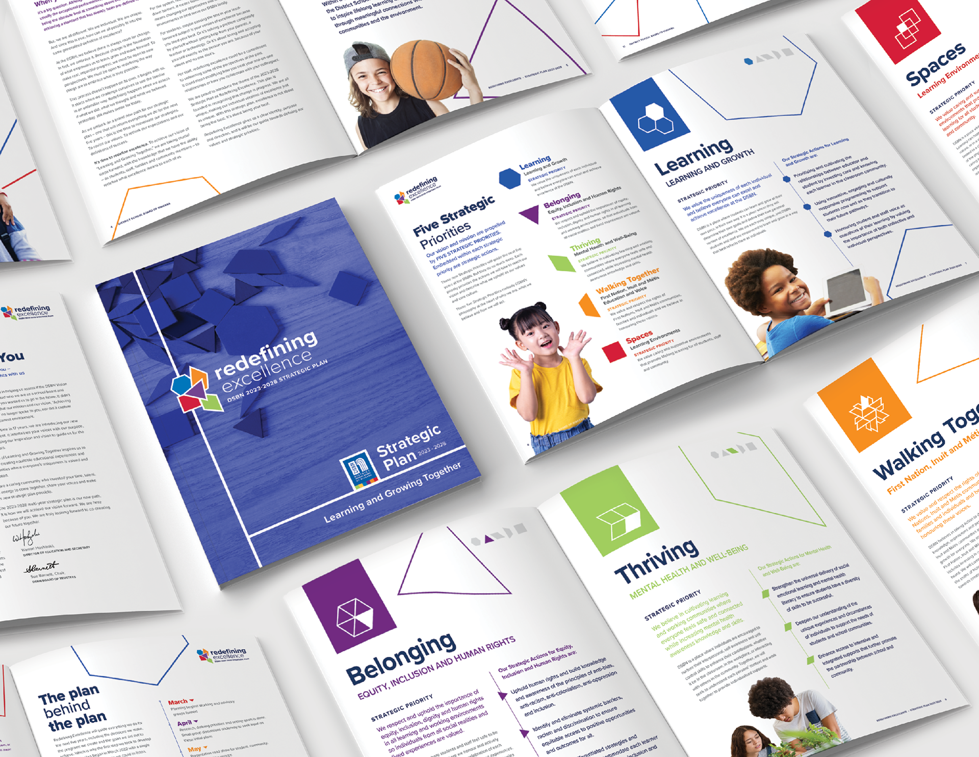
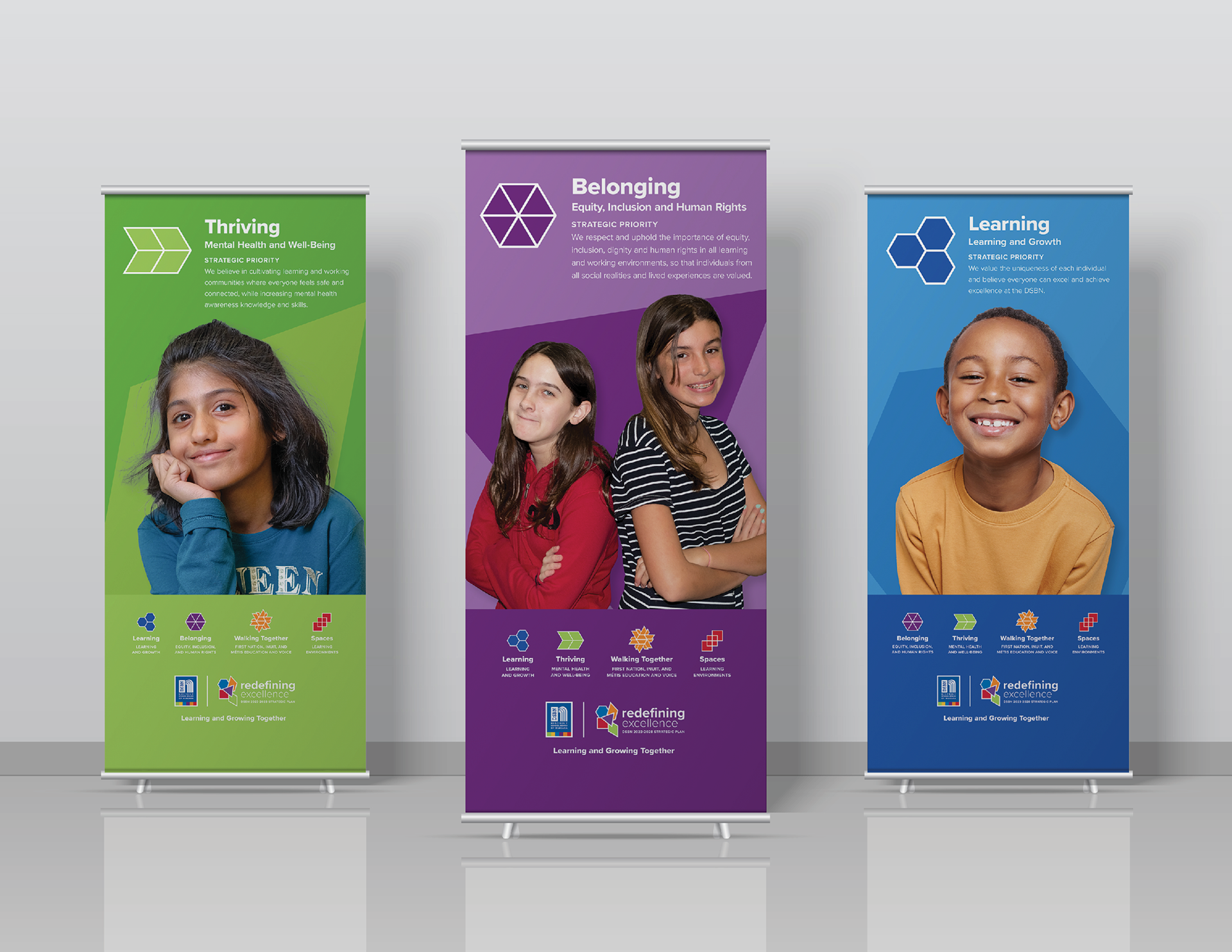
We are all unique, making our individual versions of excellence just as unique. With this strategic plan, excellence is not about being the best. It’s about being your best. I crafted the brand identity to inspire learning and growth through playful, tactile polyform shapes. The logo, portrays fallen shapes coming together in an unstructured form representing individuality. Each shape represents a priority action that we will take to reach our vision and describe what we uphold as our values and core culture. Proxima was chosen for typography as its geometric, modern and versatile structure, pairs well with the geometric shapes of the icon. The DSBN believes there is always room for change. In fact, they embrace it. Because change is the foundation of what empowers us to learn, grow and move forward. To make real, impactful progress, we must be open to new perspectives.